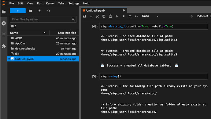
Minor UX - dark mode scheme is inconsistent/ inverted

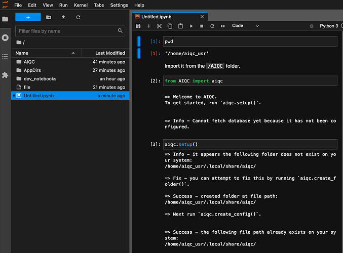
I love dark modes, but the JupyterLab dark mode always felt odd in comparison to the light mode. It didn’t feel like a notebook. It felt like the cells were floating in empty space. Why?


In light mode:

  • The page background and the file explorer background are the same color.
  • The cell backgrounds are darker than the page backgrounds.

However, in dark mode, the opposite is true:

  • The page background (#111111) and the file explorer background (#212121) are the different colors.
  • The cell backgrounds (#212121) are lighter than the page background (#111111).

Current design:

Proposed design (switches cell background and page background):


Bonuses:

  • Colors that are close to pure black/ white makes humans feel nervous. These changes would alleviate this by making the page backround lighter.
  • By making the code cells darker it increases the contrast (emphasis) on what matters most, the user input.
2 Likes

I like this idea, thank you for exploring this! Please feel welcome to open an enhancement issue on Issues · jupyterlab/jupyterlab · GitHub so we can discuss it with more users and developers. Whether we decide to adopt this change by default or not, this would be an excellent custom theme.

One thing which will require extra attention is the editor itself. It has more complexity than immediately apparent as there are colours for:

  • focused editor,
  • blurred editor,
  • line with cursor highlighted in the editor,
  • line on debugger instruction highlighted in the editor

and I think more things I have now forgotten. All of these would need to be adjusted and thoroughly tested. There are also error message boxes and we will need to check if their red is still nice on the lighter grey. But definitely worth exploring!

3 Likes