Hi,
I’ve used Jupyter Notebooks minimally and have done some basic plotting.
I’ve written a Python script in Jupyter which reads in the contents of a wave file and plots it.
However, I need to look for a certain signature in the audio. In order to do that I need to zoom in, but I need to zoom in at specific areas of the audio. To do that, I want to be able to see the zoomed and unzoomed views at the same time, but I don’t know how to do this with the vizualization libraries.
Additionally, I need to move (scroll) the zoomed area back and forth through the unzoomed wave file while looking for these signatures.
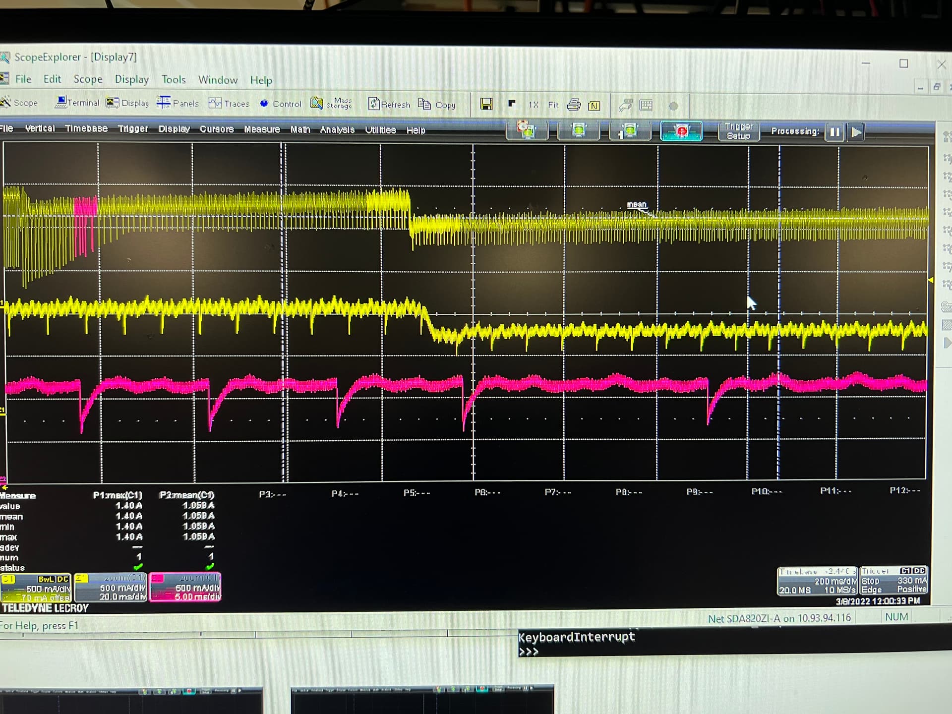
I’m using the attached picture as an example of what I am trying to do. The ocilloscope and signals are on the scope are not part of my project/program.
The attached picture is a picture of an oscilloscope trace with 3 different views of the same signal.
The top trace is the unzoomed signal.
The middle trace is zoom level 1. Note its position in the top trace- where the yellow is bright and bold.
I want to be able to move the bold highlight in the top trace back and forth as well as change the width of the
bright/bold part in the top trace, at the same time the middle trace will move in sync with the position of the bright/bold area in the top trace.
The bottom trace is zoom level 2. This is the highest level of zoom.
Note the pink bold section of the top trace- far left. As the pink area is moved (and lengthened/narrowed) in the top trace, the bottom trace will be updated accordingly.
Can this type of zooming & plot correlation be done with the Python visualization libraries?
If so, which libraries would you recommend for this?
Would you also provide some examples on how to do this?
This is way over my Jupyter experience but will help me significantly with my project.
I will use Ipywidgets to:
- Move the zoom positions through the unzoomed signal.
- Widen/narrow the bold section in the unzoomed signal
Ideally, showing the time (offset from the beginning of the wave file along the X axis) for all 3 signals would be very helpful too. The wave file uses sample numbers, but that can somehow be correlated to time. Although, knowing how to show the time differences for each level of zoom is beyond me.
Thanks